If you follow this blog, you already know how emphatic I am about eliminating friction with any type of transaction with your clients. And I’m not talking about verbal friction, but rather, creating a frictionless environment to get them from point A to point B as easy and efficiently as possible.
This is even more critical when you’re selling a product or service online. You’re always fighting friction. You want your customers to experience minimal friction when they decide to buy our product. This is once again where Amazon excels with their easy checkout process and their “buy-one-click” option.
Think about it. When you already know what you want to buy and are ready to check out and pay for it, the last thing you want is having to go through a tedious and multi-page checkout process. Instead, you just “Buy One Click” and you’re done. It’s just more convenient, it saves time and especially, it’s frictionless compared to a traditional checkout. You may need a thorough checkout process while booking your next flight to Europe but definitely not if you’re just buying a toaster.
Almost 70% of online shoppers will abandon their cart after browsing your store; that’s a lot of potential revenue lost! Having a a one-page checkout can encourage customers to complete their purchase.
Cart Abandonment Also Happens During Checkout
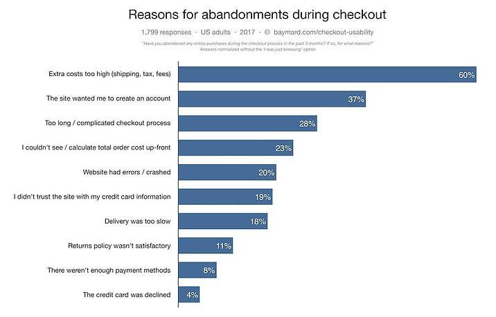
There are many reasons why somebody might leave your online store with an incomplete purchase. Among the most common ones, you’ll see hidden or extra fees, lack of trust in the security measures, and required account registration.
However, according to studies completed by Statista, SaleCycle, and Barilliance, another major reason is a long or complicated checkout process. In 2017, 28% of consumers in a study reported abandoning their cart due to a long or confusing checkout process. In other words, failure in the checkout design or process was the third-highest reason for cart abandonment. (Read: multi-page checkouts create more opportunity for confusion).
Smartphone Shoppers Are More Likely to Abandon Their Cart
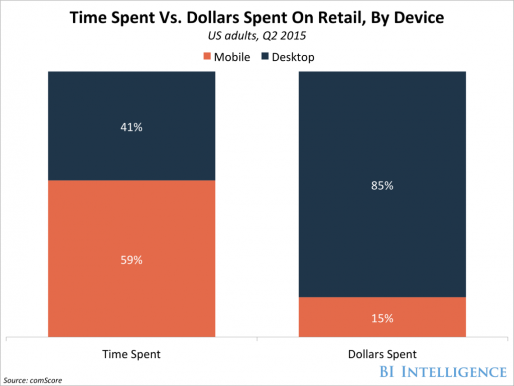
Mobile-ecommerce has been on the rise for a long time, with revenue increasing approximately 1.5x each year for the past 7 years. However, despite that, statistics show that mobile users are 70% less likely to spend than desktop users.
When you look at the above graphic, you’ll quickly realize how much opportunity is lost, or rather, how much more revenue could be made if your mobile experience was just as efficient as your desktop experience. One thing is clear: if you desktop checkout process has any type of friction, your mobile version will only make it more intrusive and your mobile users will find it extremely annoying.
Optimizing the mobile shopping experience is extremely important to keep customers on your website – after all, 88% of mobile shoppers report having a negative experience on a mobile website due to difficult navigation and an annoying checkout process. At that point, customers tend to get frustrated and leave the site.
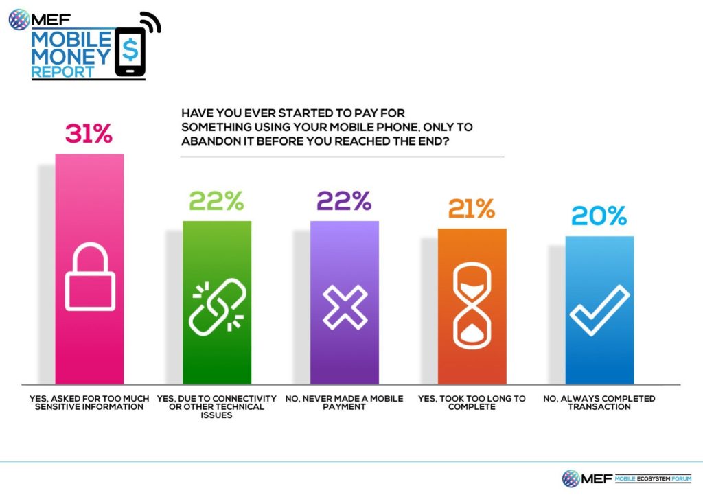
When surveys show that 21% of people have abandoned a cart while on their phone due to the checkout process being too long, you know this is something you’ll want to optimize. Mobile means your customers are on the go. That also means they are less patient. Less patient leads to higher abandonment rates during checkout and loss of revenue. Simple, right?
When to Use One Page Checkout
One Page Checkout is always an option to minimize friction during the very last stage of your conversion funnel. However, it may not always be the best solution. Here’s what you need to know when using them…
If you’re using a multi-page checkout, you’ll want to include no more than five steps in the checkout process according to this infographic. It’s also useful to have a progress bar so that customers are aware of how much longer they need to spend clicking through pages, filling out their information, reviewing their order, etc.
When you’re dealing with repeated customers, or even new customers that are already familiar with the product/service they want to buy, it’s always best to provide them with the option to check out as quickly as possible via One Page Checkout.
- It’s faster (read: can shave off almost a minute from the checkout process, which translates into less time for people to change their mind and leave their incomplete purchase behind).
- It’s more user- and mobile-friendly, meaning less chance of cart abandonment due to frustration.
One final caveat though. Your One-Page checkout process needs to integrated seamlessly with your existing design and shopping cart platform. If you’re using Shopify, WooCommerce or any other major platform, you should be able to accomplish this. Otherwise, if your One-Page checkout, looks like you’re taking your customers to a separate environment outside of your online store, it will certainly spoof them and all the advantages will be lost.
If you would like to receive eCommerce and Amazon sales techniques on a regular basis, subscribe to The Edge Digest and receive weekly news directly in your INBOX.
Thank you for reading. Until next time, this is Manuel Gil del Real (MGR)
Sources: Shopify, BoldCommerce and Others per respective links.
Photo by Charles 🇵🇭 on Unsplash


